Decorating: It's So Easy Being Green
Decorating with shades of this natural color
Green is the color of tranquility, a soothing hue of spring. And regardless of Kermit the Frog’s hit song, it actually IS easy to be green. The color pairs so beautifully with blues, black and white, violets and pinks. It also happens to be one of my favorite colors of the moment. Green is appropriate any time of year – it can enhance freshness in the spring and add a deep richness during the holidays. Seeing all the different ways the rejuvenating hue has been incorporated into our décor has inspired me to share a few ways you can bring it into your home as well.
Experiment with different tints and shades. There is no shortage of variations of green. There’s seafoam, Kelly, emerald, jade, sage, pine … the list goes on. Whether earthy undertones or bright jewel, there is a shade of green for every home. Start small with pillows and accessories to find the vibrancy that works for your space, then build from there. Don’t be afraid to use multiple shades and patterns.
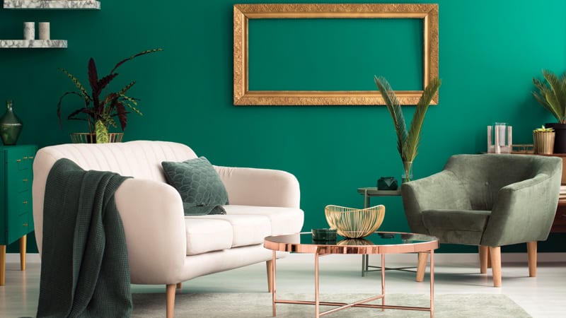
Use a variety of textures. From rich velvets to light cottons and seemingly endless patterns, fabric combinations are limitless. And when it comes to green, it’s hard to pick a favorite. Thankfully, you don’t have to. I love to mix textures. While some might stay away from big statement pieces, the bold go big. My current obsession is a deep, emerald green velvet sofa that brings elegance and depth. We have paired it with contrasting white and soft green floral printed pillows to add spring flair for the season. Come winter, switching those pillows out for gold or plaid accents will transition the piece into the holidays. Velvet can be a year-round textile.
Freshen up with greenery. Yes, I love florals, but there is something to be said for a beautiful bouquet made up entirely of greenery. It is astonishing how much depth and texture you can create with a handful of different stems. It can be a high impact design that is surprisingly simple. Dress it up with a fun container for extra flair.
Incorporate color at all levels. When done strategically, it is hard to have too much of one color. If you work at creating focal points and use these tips, you will be able to continue building on your favorite color. One of our current rooms displays just that. We have paired a lovely light kiwi wicker table with a deep jade bud vase and rich stems to demonstrate how hue and texture make all the difference. The natural element brought by the wicker acts like a neutral, making the rest of the scene blend beautifully. We also love using green as a wall color, either with paint or a green-themed gallery wall of delicate botanicals. Just be sure to mix in the texture and patterns that the room needs to draw your eye.
If green isn’t your scene, these tips and tricks work with all colors. It is all about creating a visual feast that keeps the eye well fed. You might be surprised at how your home changes with just a few additions of a new hue. Happy decorating!
Adapted from nellhills.com. Katie Laughridge is the owner of Kansas City interior design destination Nell Hill’s. For more information, contact Katie at Katie@nellhills.com.
© 2019 Tribune Content Agency, LLC